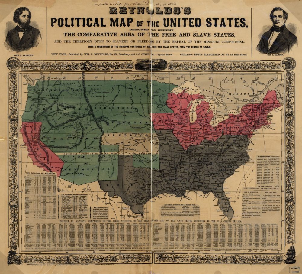
William C. Reynolds and J. C. Jones, “Reynolds’s political map of the United States, designed to exhibit the comparative area of the free and slave states and the territory open to slavery or freedom by the repeal of the Missouri Compromise,” 1856, via Library of Congress.
This piece of Republican propaganda from the 1856 election makes clear distinctions between free states, slave states, and territories. Featured at the top of the page are engravings of John C. Fremont and his running mate, William C. Dayton. A vibrant red sets off the free states. The chart, “Freedom vs. Slavery,” demonstrates the North’s economic and cultural superiority over slave states in terms of everything from population per square mile, capital in manufactures, miles of railroad, the number of newspapers and public libraries, and value of churches.